
SwiftUI Modifiers Deep Dive: presentationCompactAdaptation
Published on Oct 9, 2024Get a quick glimpse of how Tiny Currency simplifies currency conversion with up to date rates, multi-currency support, and easy-to-use widgets. Perfect for on-the-go use, our app ensures you're always prepared, no matter where your travels take you.
📱 iOS 16.4+
On this deep dive, we are exploring the presentationCompactAdaptation SwiftUI modifier, which was added in iOS 16.4.
Apple's Documentation
Some presentations adapt their appearance depending on the context. For example, a sheet presentation over a vertically-compact view uses a full-screen-cover appearance by default. Use this modifier to indicate a custom adaptation preference. For example, the following code uses a presentation adaptation value of none to request that the system not adapt the sheet in compact size classes:
struct ContentView: View {
    @State private var showSettings = false

    var body: some View {
        Button("View Settings") {
            showSettings = true
        }
        .sheet(isPresented: $showSettings) {
            SettingsView()
                .presentationDetents([.medium, .large])
                .presentationCompactAdaptation(.none)
        }
    }
}
Usage
My main use case for this modifier is simply to show a popover view on compact size classes.
Let's take this simple example:
struct ContentView: View {
    @State private var showPopover = false

    var body: some View {
        Button("View Popover") {
            showPopover = true
        }
        .popover(isPresented: $showPopover) {
            Text("This is a popover")
                .padding()
        }
    }
}
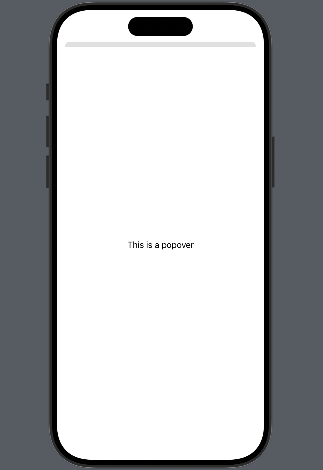
The example above would be how we would display a popover in SwiftUI. This works as expected on regular size classes (iPad in regular width mode), however in compact size classes it shows up as a sheet:
 | 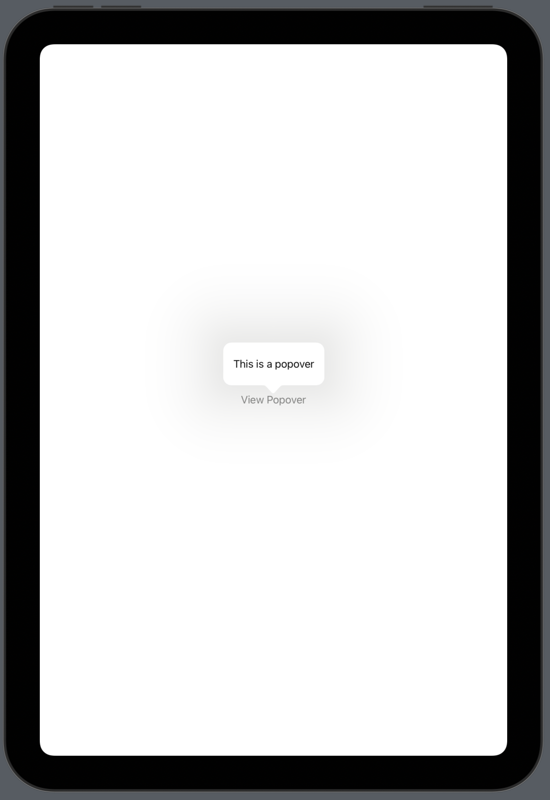 |
But what if we wanted a popover in compact size classes?
Well, that's where this simple modifier comes in:
struct ContentView: View {
    @State private var showPopover = false

    var body: some View {
        Button("View Popover") {
            showPopover = true
        }
        .popover(isPresented: $showPopover) {
            Text("This is a popover")
                .padding()
                .presentationCompactAdaptation(.popover)
        }
    }
}
You can specify a few other styles of PresentationAdaptation as well, which apple specifies in the docs.
If you ever need to show a popover in compact size classes, now you know how!