
Building Better Forms with LabeledContent in SwiftUI
Published on Oct 7, 2024Get a quick glimpse of how Tiny Currency simplifies currency conversion with up to date rates, multi-currency support, and easy-to-use widgets. Perfect for on-the-go use, our app ensures you're always prepared, no matter where your travels take you.
📱 iOS 16.0+
Apple introduced LabeledContent in iOS 16.0 to make it easier to line up views in certain contexts. If you've been working in iOS for a while, this may be reminiscent of accessory views in UIKit.
Apple's Documentation
The instance’s content represents a read-only or read-write value, and its label identifies or describes the purpose of that value. The resulting element has a layout that’s consistent with other framework controls and automatically adapts to its container, like a form or toolbar. Some styles of labeled content also apply styling or behaviors to the value content, like making Text views selectable.
Usage
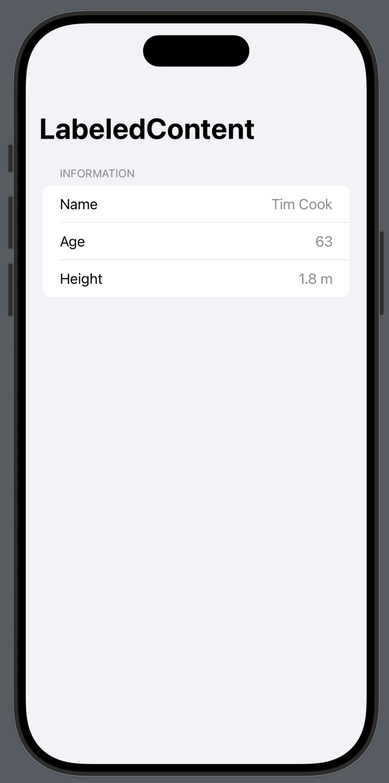
Apple provides several examples of how to use LabeledContent, let's take a look at one of the simplest examples in a form:
Form {
    Section("Information") {
        LabeledContent("Name", value: person.name)
        LabeledContent("Age", value: person.age, format: .number)
        LabeledContent("Height", value: person.height,
            format: .measurement(width: .abbreviated))
    }
}
Here we see that LabeledContent takes a key for the title, as well as a value to display for the content.
We also have other initializers for LabeledContent that can customize both the label and the content:
Form {
    // Custom Content
    LabeledContent("Custom Value") {
        Text("Hello, World!")
    }

    // Custom Label (with subtitle) and Content
    LabeledContent {
        Text("Hello, World!")
    } label: {
        Text("Custom Value")
        Text("Custom Subtitle Value")
    }

    // Custom Label (with system image) and Content
    LabeledContent {
        Text("Hello, World!")
    } label: {
        Label("Custom Value", systemImage: "hammer")
    }
}
Let's see what the above looks like:
 | 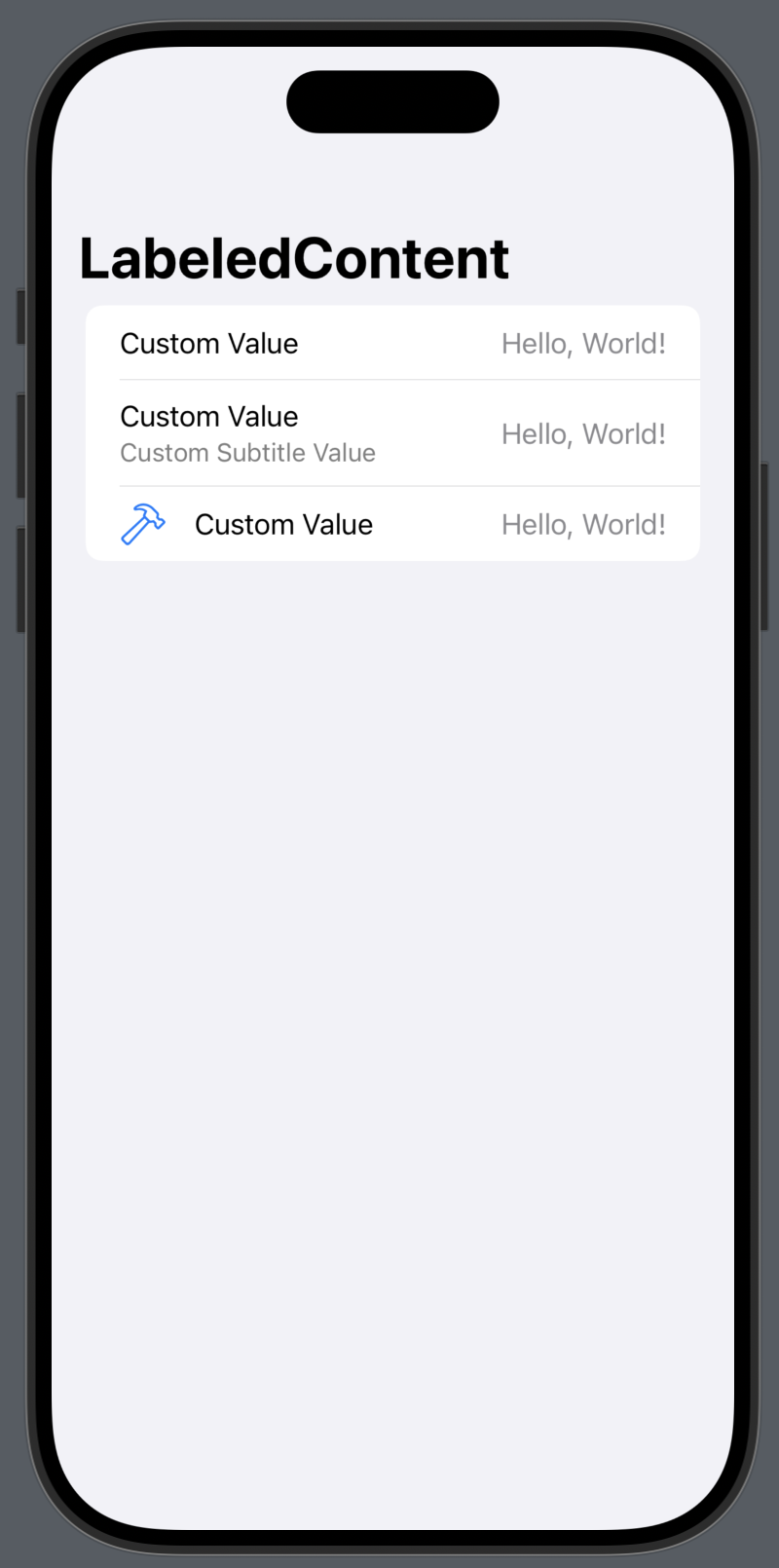 |
As you can see, this is very reminiscent of UIKit accessory views within the context of UITableView. It's a great way to create content that works in various contexts.
In this article, I focussed on forms, but you can use LabeledContent in any context and it would work quite similarly to what we see in the images.
If you do want to take it a step further and create your own custom LabeledContent, you can do so by creating custom LabeledContent styles, and applying them using the labeledContentStyle modifier.