
SwiftUI Modifiers Deep Dive: foregroundStyle
Published on Sep 25, 2024Get a quick glimpse of how Tiny Currency simplifies currency conversion with up to date rates, multi-currency support, and easy-to-use widgets. Perfect for on-the-go use, our app ensures you're always prepared, no matter where your travels take you.
Today's post is a simple one, a modifier that many of us are familiar with, but I want to dive a bit deeper on a special use case of foregroundStyle that is often overlooked.
📱 iOS 15.0+
On this deep dive, we are exploring the foregroundStyle SwiftUI modifier, which was added in iOS 15.0.
Apple's Documentation
Sets a view’s foreground elements to use a given style.
Where style is a parameter defined as:
The color or pattern to use when filling in the foreground elements. To indicate a specific value, use Color or image(_:sourceRect:scale:), or one of the gradient types, like linearGradient(colors:startPoint:endPoint:). To set a style that’s relative to the containing view’s style, use one of the semantic styles, like primary.
Apple then provides several examples on how foreground styles works, but I want to focus on one particular kind: hierarchical styles.
Hierarchical Styles
Apple's documentation also states the following:
Hierarchical foreground styles like ShapeStyle/secondary don’t impose a style of their own, but instead modify other styles. In particular, they modify the primary level of the current foreground style to the degree given by the hierarchical style’s name. To find the current foreground style to modify, SwiftUI looks for the innermost containing style that you apply with the foregroundStyle(:) or the foregroundColor(:) modifier. If you haven’t specified a style, SwiftUI uses the default foreground style, as in the following example:loca
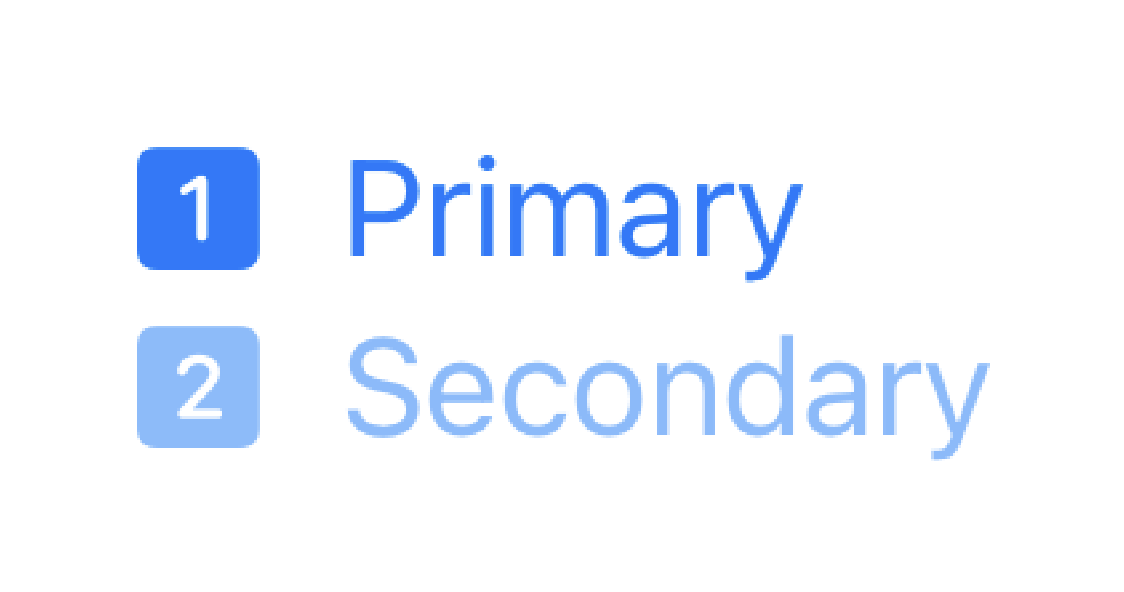
Here is an example:
VStack(alignment: .leading) {
    Label("Primary", systemImage: "1.square.fill")
    Label("Secondary", systemImage: "2.square.fill")
        .foregroundStyle(.secondary)
}
.foregroundStyle(.blue)
Which produces the following view:
Hierarchical styles are a great way to signify hierarchy in your reusable views, but then if you want to tint your entire views, you can easily choose a style to apply to the entire view. This type of use case is easy to miss because it uses the same modifier, so it can be a bit confusing.
One more feature of this modifier is another interesting use case. What if you had this type of reusable view, but you only wanted to tint a specific hierarchy, such as primary or secondary? Well, the same modifier can also be used for that. It allows modifying up to tertiary hierarchy styles. Let's take a look at an example:
VStack(alignment: .leading) {
    Label("Primary", systemImage: "1.square.fill")
    Label("Secondary", systemImage: "2.square.fill")
        .foregroundStyle(.secondary)
}
.symbolRenderingMode(.monochrome)
.foregroundStyle(.blue, .secondary)
// This will only apply blue to the primary foreground style

VStack(alignment: .leading) {
    Label("Primary", systemImage: "1.square.fill")
    Label("Secondary", systemImage: "2.square.fill")
        .foregroundStyle(.secondary)
}
.symbolRenderingMode(.monochrome)
.foregroundStyle(.primary, .blue.secondary)
// This will only apply blue to the secondary foreground style
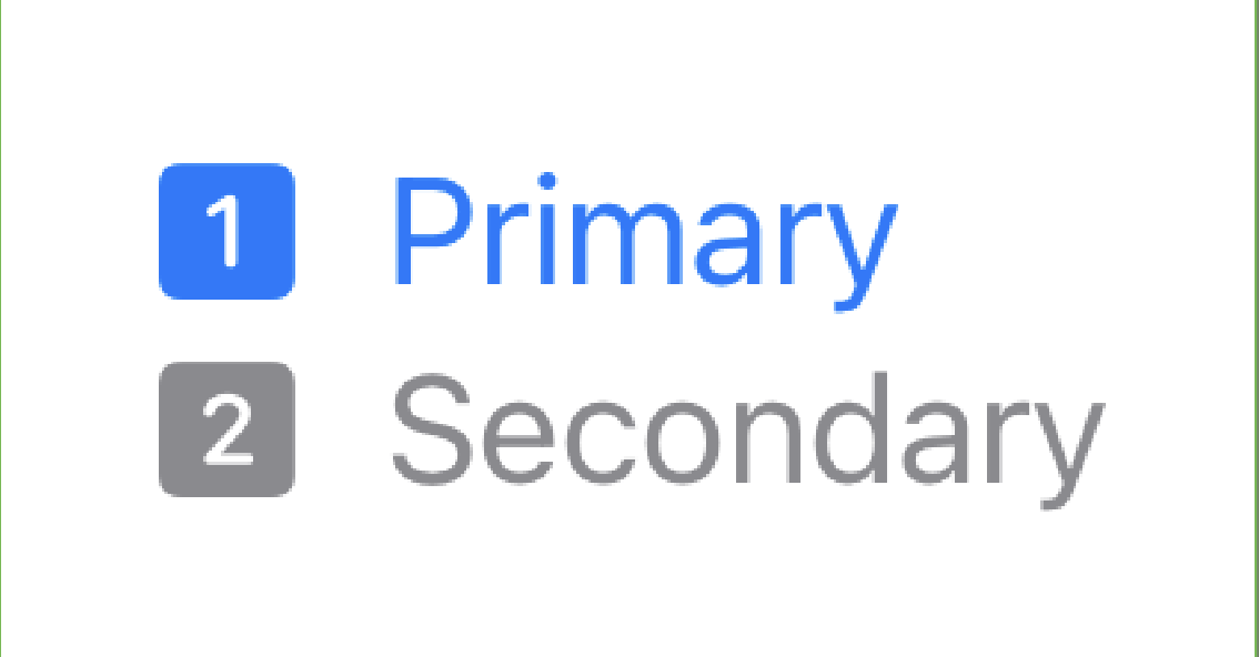 | 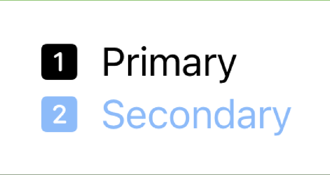 |
As you can see, we are able to apply colors to specific hierarchies. I also had to add a call to .symbolRenderingMode to adjust the symbol rendering, since symbols render with a hierarchy by default.
Check back next week to find out more about .symbolRenderingMode in the next SwiftUI Modifiers Deep Dive!