
SwiftUI Modifiers Deep Dive: containerBackground
Published on Aug 28, 2024Get a quick glimpse of how Tiny Currency simplifies currency conversion with up to date rates, multi-currency support, and easy-to-use widgets. Perfect for on-the-go use, our app ensures you're always prepared, no matter where your travels take you.
📱 iOS 17.0+
On this deep dive, we are exploring the containerBackground SwiftUI modifier, which was added in iOS 17.
Apple's summary:
Sets the container background of the enclosing container using a view.
This API seems to have been specifically added to add a background to Widgets, annd StoreKit views in iOS 17, taking a parameter for the container type as a ContainerBackgroundPlacement.
🆕 iOS 18.0+ | macOS 15.0+
In iOS 18 the API adds support for Navigation Bars on iOS with ContainerBackgroundPlacement.navigation. In macOS 15, the API adds window support with ContainerBackgroundPlacement.window.
Usage
Widgets
When creating a Widget extension in iOS 17.0+, the WidgetConfiguration now expects your SwiftUI widget view to use the containerBackground modifier.
struct MyWidget: Widget {
    let kind: String = "MyWidget"

    var body: some WidgetConfiguration {
        StaticConfiguration(kind: kind, provider: Provider()) { entry in
            MyWidgetEntryView(entry: entry)
                .containerBackground(.green.gradient, for: .widget)
        }
        .configurationDisplayName("My Widget")
        .description("This is an example widget.")
    }
}
We've applied a green gradient here, and we can preview the widget like so:
#Preview(as: .systemSmall) {
    MyWidget()
} timeline: {
    SimpleEntry(date: .now, emoji: "😀")
}
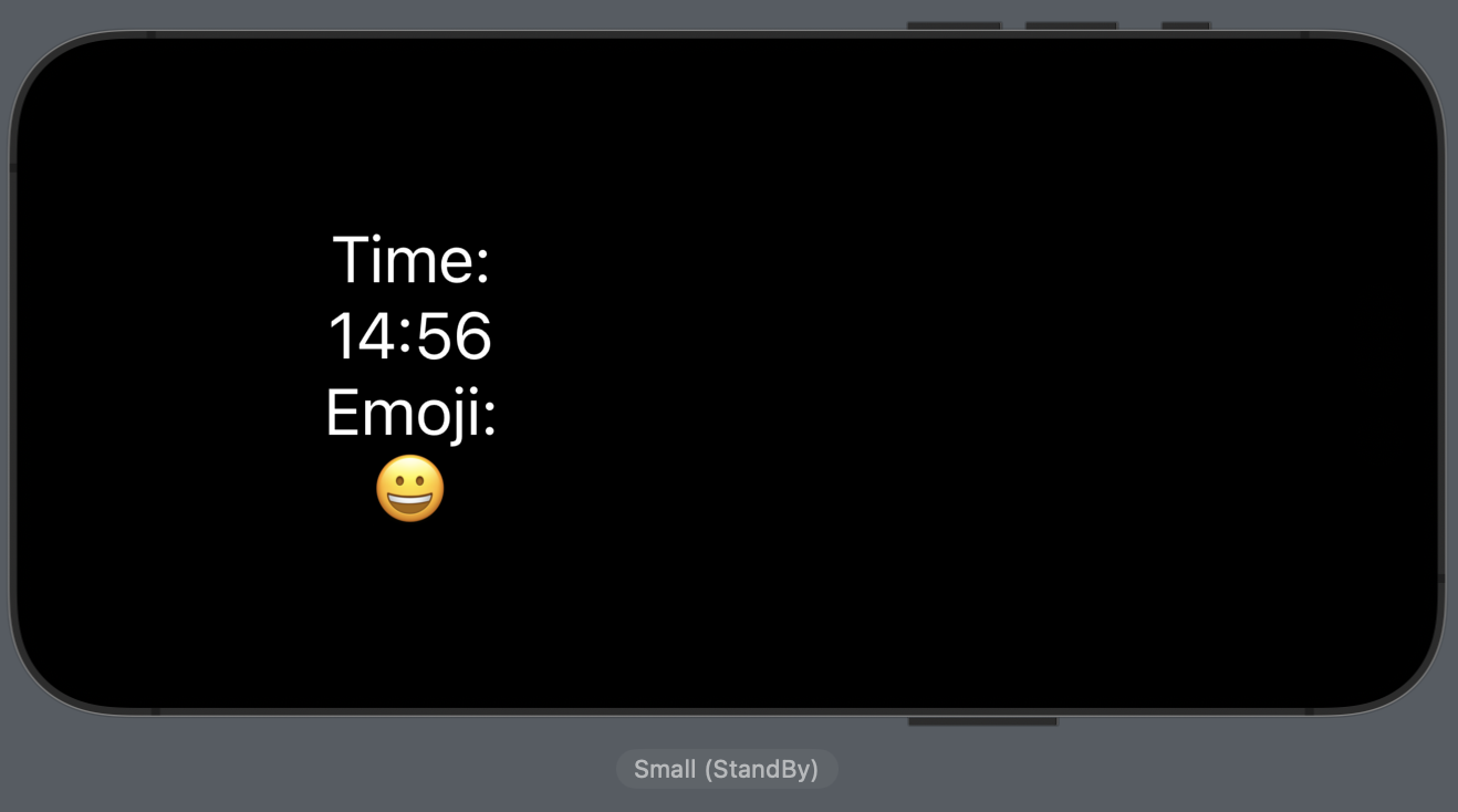
With the new containerBackground modifier, the background is automatically changed based on the type of widget added.
Here is what it looks like as a regular Home Screen widget next to a Lock Screen widget, and below that you can find the StandBy version as well:
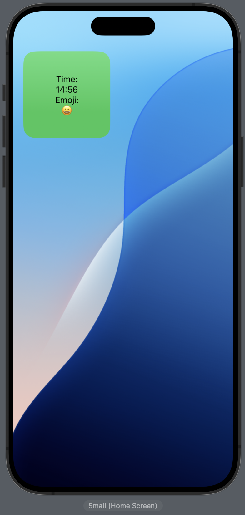 | 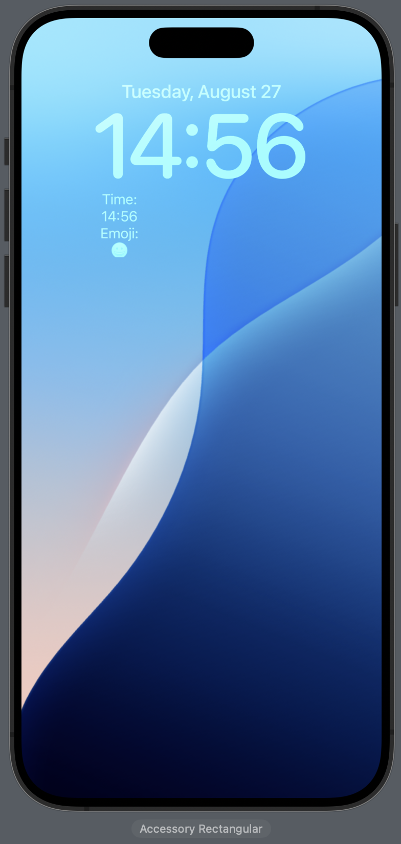 |
Navigation (iOS 18.0+)
Apple also provides us with a code example as well, showing the iOS 18+ API in use:
struct ContentView: View {
    var body: some View {
        NavigationStack {
            List {
                NavigationLink("Blue") {
                    Text("Blue")
                        .containerBackground(.blue.gradient, for: .navigation)
                }
                NavigationLink("Red") {
                    Text("Red")
                        .containerBackground(.red.gradient, for: .navigation)
                }
            }
        }
    }
}
The code example provided by Apple doesn't really showcase what the API does properly because of the sizing of the text, so we can expand the frames of the Text to give us a better idea of how it works. We can rewrite the example like so:
struct ContentView: View {
    var body: some View {
        NavigationStack {
            List {
                NavigationLink("Blue") {
                    Text("Blue")
                        .frame(maxWidth: .infinity, maxHeight: .infinity) // expand the frame
                        .containerBackground(.blue.gradient, for: .navigation)
                }
                NavigationLink("Red") {
                    Text("Red")
                        .frame(maxWidth: .infinity, maxHeight: .infinity) // expand the frame
                        .containerBackground(.red.gradient, for: .navigation)
                }
            }
        }
    }
}
Now what exactly is the difference between using containerBackground and background here? It's not apparent at first, although there is also a ContainerBackgroundPlacement.navigationSplitView that works with split views on iPadOS/macOS. Apple is likely doing some adaptive handling similar to how the widget backgrounds work.
If any readers have any more insights, please let me know!
Look out for more SwiftUI view modifier deep dives on Wednesdays.